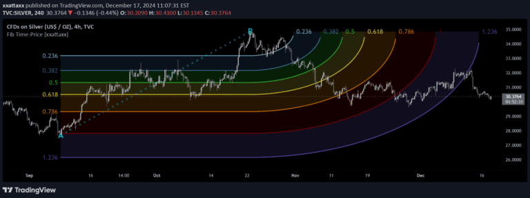
A unique trading visualization technique that maps price movements using Penrose diagrams, transforming complex market data into a spatial representation of potential trading scenarios.
Explore complementary indicator rolesHow it works
The Penrose Diagram adapts a complex spacetime mapping technique to financial markets by projecting price data onto a two-dimensional square. It calculates triangular formations based on average highest and lowest price points over a specified period, typically 20-30 days depending on the instrument.
The diagram uses straight lines to represent price movements and creates overlapping triangles that reveal potential market dynamics. Each triangle is precisely rotated and translated around the session's open price, providing a unique visual representation of market structure
Why it may be useful
This innovative approach offers traders a novel perspective on market movements by transforming traditional price data into a geometric representation. By mapping price fluctuations onto a Penrose diagram, traders can potentially identify complex market patterns that might be less apparent in conventional charts.
The technique provides insights into market structure, potential trend directions, and hidden relationships between price points that standard technical analysis might overlook
When to explore it
The Penrose Diagram works best when analyzing markets with significant price variations, particularly in futures, forex, and cryptocurrency markets. It is most effective for traders seeking alternative visualization techniques beyond traditional technical analysis.
Ideal for swing and day traders who want to understand market geometry and potential price trajectories. Works well when combined with other technical indicators to confirm potential market movements and provide additional context to trading decisions
Keep exploring
What we’ve verified
Access, alerts and repainting behaviour have not been independently verified for this indicator. Check the creator’s current publication and settings.
General descriptions and classifications are recovered research. Verified details above identify the specific checks we have completed. Check the creator’s current publication for later changes.